Deliverables
3D Design
Graphic Design
3D Design
Multi Media
Creative Direction
Client
kāhvi
Deliverables
3D Design
Graphic Design
3D Design
Multi Media
Creative Direction
Client
kāhvi
kāhvi, your new morning habit.
kāhvi, your new morning habit.

Something worth waking up for.
Something worth waking up for.
kāhvi takes its name from the Finnish word for coffee. A deliberate choice, given Finland's reputation as one of the world's most coffee dependent nations. The macron over the ā acknowledges te reo Māori, stretching the vowel and quietly anchoring the brand to the place it was made. A name that does two things at once.
kāhvi takes its name from the Finnish word for coffee. A deliberate choice, given Finland's reputation as one of the world's most coffee dependent nations. The macron over the ā acknowledges te reo Māori, stretching the vowel and quietly anchoring the brand to the place it was made. A name that does two things at once.


Subtle was never the brief.
Subtle was never the brief.
Subtle was never the brief.
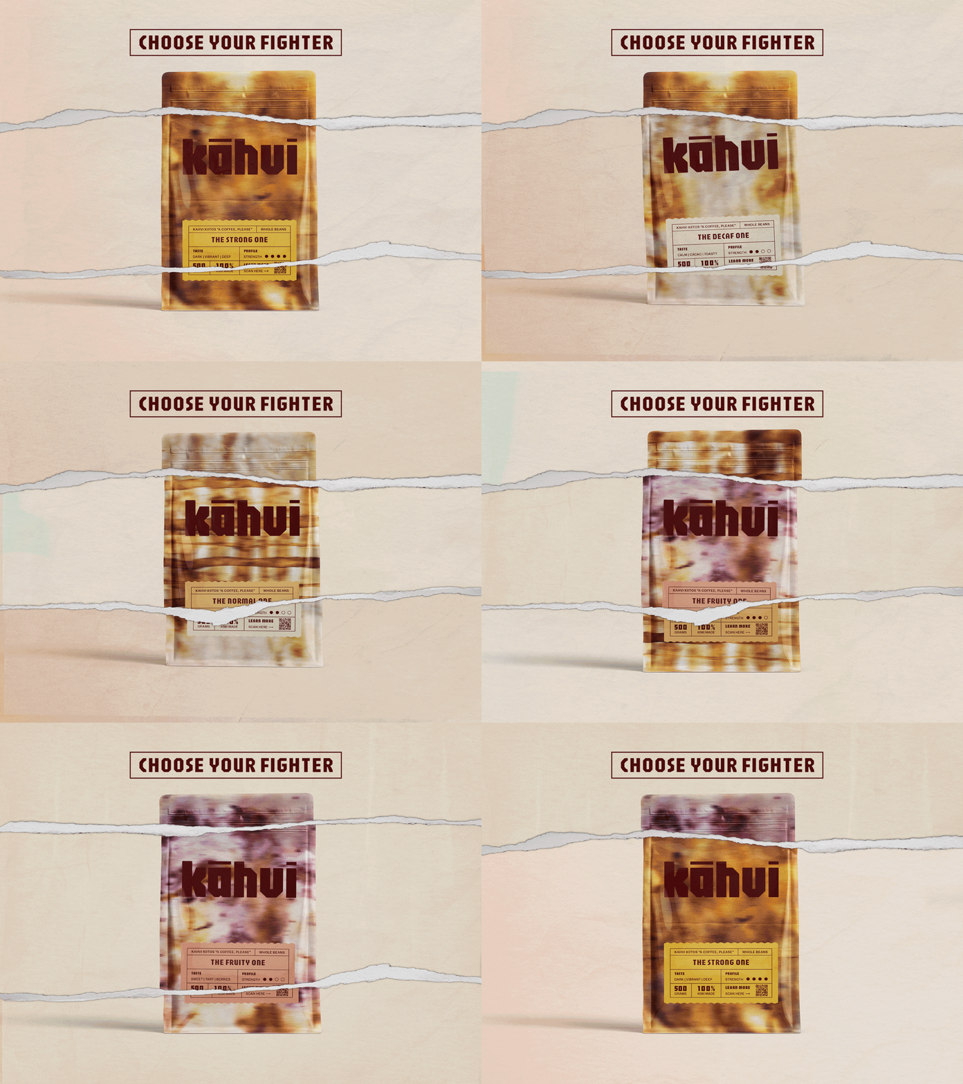
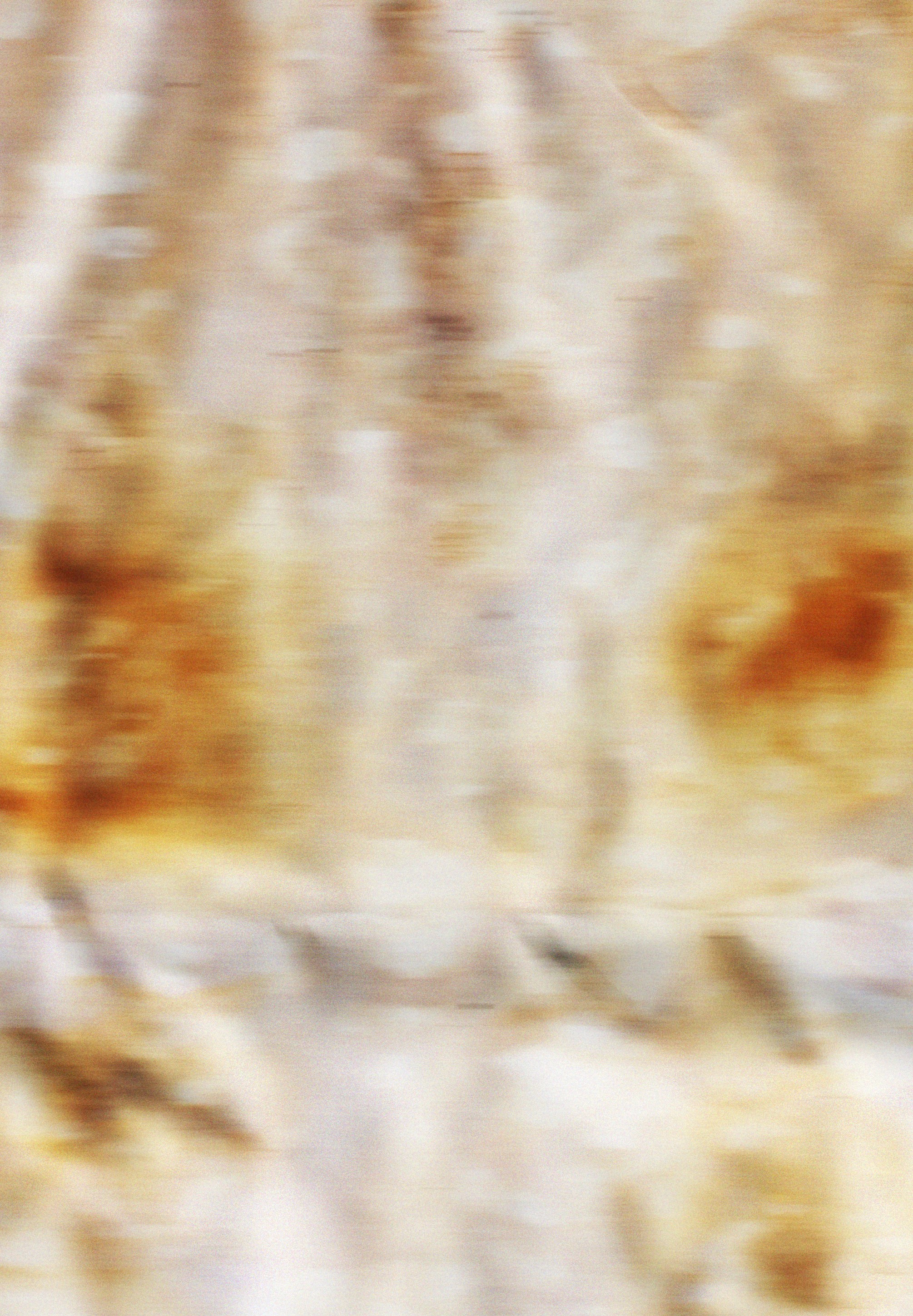
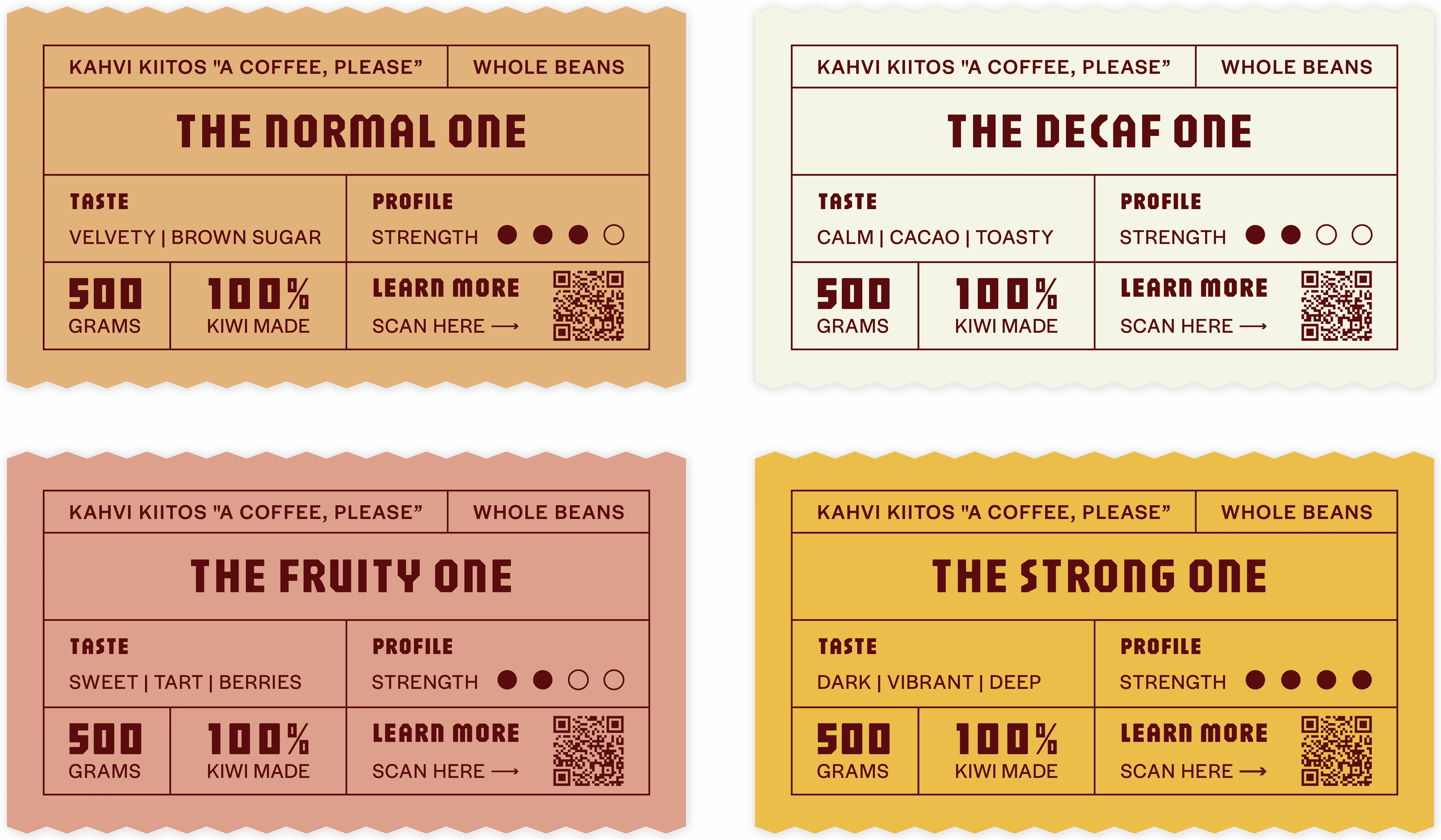
The packaging was designed to stop people mid-aisle. Rich, saturated colour and bold typography push against the quieter, more minimal direction most coffee brands default to. The goal was simple. Look different on a shelf, and mean it. The background textures start with the ingredients themselves. Painted by hand using coffee and berries, built up in layers, then photographed and refined digitally to draw out the depth of tone. Each variety is visually distinct before you ever reach for the bag. The logo follows the same logic. A custom letterform designed to match the energy of everything around it.
The packaging was designed to stop people mid-aisle. Rich, saturated colour and bold typography push against the quieter, more minimal direction most coffee brands default to. The goal was simple. Look different on a shelf, and mean it. The background textures start with the ingredients themselves. Painted by hand using coffee and berries, built up in layers, then photographed and refined digitally to draw out the depth of tone. Each variety is visually distinct before you ever reach for the bag. The logo follows the same logic. A custom letterform designed to match the energy of everything around it.
The packaging was designed to stop people mid-aisle. Rich, saturated colour and bold typography push against the quieter, more minimal direction most coffee brands default to. The goal was simple. Look different on a shelf, and mean it. The background textures start with the ingredients themselves. Painted by hand using coffee and berries, built up in layers, then photographed and refined digitally to draw out the depth of tone. Each variety is visually distinct before you ever reach for the bag. The logo follows the same logic. A custom letterform designed to match the energy of everything around it.


Deliverables
3D Design
Graphic Design
3D Design
Multi Media
Creative Direction
Client
kāhvi
Deliverables
3D Design
Graphic Design
3D Design
Multi Media
Creative Direction
Client
kāhvi
kāhvi, your new morning habit.
kāhvi, your new morning habit.
Something worth waking up for.
Something worth waking up for.
kāhvi takes its name from the Finnish word for coffee. A deliberate choice, given Finland's reputation as one of the world's most coffee dependent nations. The macron over the ā acknowledges te reo Māori, stretching the vowel and quietly anchoring the brand to the place it was made. A name that does two things at once.
kāhvi takes its name from the Finnish word for coffee. A deliberate choice, given Finland's reputation as one of the world's most coffee dependent nations. The macron over the ā acknowledges te reo Māori, stretching the vowel and quietly anchoring the brand to the place it was made. A name that does two things at once.
Subtle was never the brief.
Subtle was never the brief.
Subtle was never the brief.
The packaging was designed to stop people mid-aisle. Rich, saturated colour and bold typography push against the quieter, more minimal direction most coffee brands default to. The goal was simple. Look different on a shelf, and mean it. The background textures start with the ingredients themselves. Painted by hand using coffee and berries, built up in layers, then photographed and refined digitally to draw out the depth of tone. Each variety is visually distinct before you ever reach for the bag. The logo follows the same logic. A custom letterform designed to match the energy of everything around it.
The packaging was designed to stop people mid-aisle. Rich, saturated colour and bold typography push against the quieter, more minimal direction most coffee brands default to. The goal was simple. Look different on a shelf, and mean it. The background textures start with the ingredients themselves. Painted by hand using coffee and berries, built up in layers, then photographed and refined digitally to draw out the depth of tone. Each variety is visually distinct before you ever reach for the bag. The logo follows the same logic. A custom letterform designed to match the energy of everything around it.
The packaging was designed to stop people mid-aisle. Rich, saturated colour and bold typography push against the quieter, more minimal direction most coffee brands default to. The goal was simple. Look different on a shelf, and mean it. The background textures start with the ingredients themselves. Painted by hand using coffee and berries, built up in layers, then photographed and refined digitally to draw out the depth of tone. Each variety is visually distinct before you ever reach for the bag. The logo follows the same logic. A custom letterform designed to match the energy of everything around it.
Deliverables
3D Design
Graphic Design
3D Design
Multi Media
Creative Direction
Client
kāhvi
Deliverables
3D Design
Graphic Design
3D Design
Multi Media
Creative Direction
Client
kāhvi
kāhvi, your new morning habit.
kāhvi, your new morning habit.
Something worth waking up for.
Something worth waking up for.
kāhvi takes its name from the Finnish word for coffee. A deliberate choice, given Finland's reputation as one of the world's most coffee dependent nations. The macron over the ā acknowledges te reo Māori, stretching the vowel and quietly anchoring the brand to the place it was made. A name that does two things at once.
kāhvi takes its name from the Finnish word for coffee. A deliberate choice, given Finland's reputation as one of the world's most coffee dependent nations. The macron over the ā acknowledges te reo Māori, stretching the vowel and quietly anchoring the brand to the place it was made. A name that does two things at once.
Subtle was never the brief.
Subtle was never the brief.
Subtle was never the brief.
The packaging was designed to stop people mid-aisle. Rich, saturated colour and bold typography push against the quieter, more minimal direction most coffee brands default to. The goal was simple. Look different on a shelf, and mean it. The background textures start with the ingredients themselves. Painted by hand using coffee and berries, built up in layers, then photographed and refined digitally to draw out the depth of tone. Each variety is visually distinct before you ever reach for the bag. The logo follows the same logic. A custom letterform designed to match the energy of everything around it.
The packaging was designed to stop people mid-aisle. Rich, saturated colour and bold typography push against the quieter, more minimal direction most coffee brands default to. The goal was simple. Look different on a shelf, and mean it. The background textures start with the ingredients themselves. Painted by hand using coffee and berries, built up in layers, then photographed and refined digitally to draw out the depth of tone. Each variety is visually distinct before you ever reach for the bag. The logo follows the same logic. A custom letterform designed to match the energy of everything around it.
The packaging was designed to stop people mid-aisle. Rich, saturated colour and bold typography push against the quieter, more minimal direction most coffee brands default to. The goal was simple. Look different on a shelf, and mean it. The background textures start with the ingredients themselves. Painted by hand using coffee and berries, built up in layers, then photographed and refined digitally to draw out the depth of tone. Each variety is visually distinct before you ever reach for the bag. The logo follows the same logic. A custom letterform designed to match the energy of everything around it.